EXTRA-TROPICAL STORM SURGE
N A T I O N A L O C E A N I C A N D A T M O S P H E R I C A D M I N I S T R A T I O N
N A T I O N A L O C E A N I C A N D A T M O S P H E R I C A D M I N I S T R A T I O N
| MDL Storm Surge | NHC Storm Surge | P-Surge | P-ETSS | ETSS | Orig. ETSS | AHPS | OPC | CO-OPS | NowCoast |
|
Main Site Mirror Site |
Contents: About, Graph, Status Maps, History Button, Credits To use this website, click on the appropriate REGION. This will update the list of STATIONS and show a "Status Map" for that region. Click on your desired station, either on the map or in the list of STATIONS. This will bring up a graph of the total water level, as well as a text file that contains the numbers used in the graph. The graph combines several sources of data to produce a total water level prediction. To do so, it graphs the observed water levels in comparison to the predicted tide and predicted surge before the current time. This allows it to compute the "Anomaly". The "Anomaly" is the amount of water that was not predicted by either the tide or the storm surge model. This "Anomaly" is averaged over 5 days, and is then added to the future predictions of the tide and storm surge to predict the Total Water Level. Example: 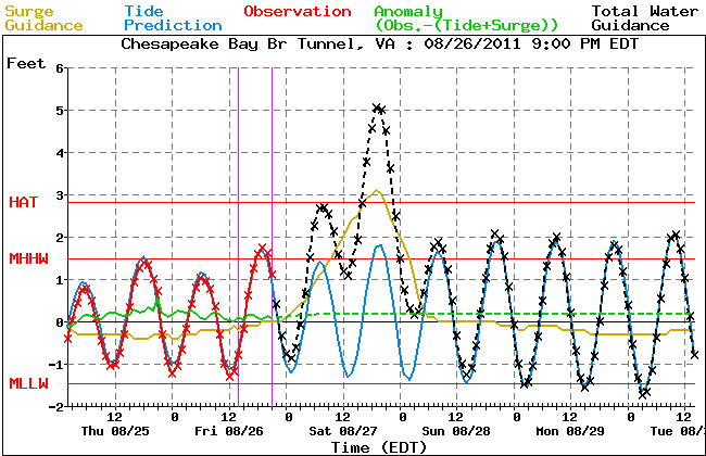 The first thing one notices is that there are two magenta vertical lines.
The earlier one is when the storm surge model was run. It is run at 0Z, 6Z, 12Z and
18Z every day and the text form is available here:
http://www.ftp.ncep.noaa.gov/data/nccf/com/etss/prod/ (look for the .txt files).
The later magenta line is when the graph was generated. It is currently generated 15 minutes
after the top of every hour. (This is also the date that follows the label.)
The next thing one notices are the horizontal lines labeled MLLW, MSL,
MHHW, and HAT. These stand for the Mean Lower Low Water, Mean Sea Level,
Mean Higher High Water, and Highest Astronomical Tide. The datums came from
https://www.co-ops.nos.noaa.gov/stations.html?type=Datums. The exception is if NOS
did not provide HAT, we computed it by computing the maximum predicted tide value
every hour (on the hour) for 19 years. The thought is that flooding will probably
occur if the total water level crosses HAT.
One might next notice the red observation line. This is based on data
attained from NOS' data API. An example for station 8571421 follows:
https://www.co-ops.nos.noaa.gov/api/datagetter? product=water_level& application=NOS.COOPS.TAC.WL& begin_date=20180311& end_date=20180312& datum=MLLW& station=8571421& time_zone=GMT& units=english& format=csv.
Please see their
Disclaimer for information as to the quality of these observations. If
there is no red line, then either Tides Online does not have data for that
station, or there has been a communications break down. In this case, the
graph computes an anomaly based on what data it has, or sets it to 0. Then
it predicts the total water level for all hours, or after the last of
any observations it does have.
The next thing of interest is the blue Tide line. This is the
astronomical tide at every hour. The Harmonic Constants used were obtained
from
http://www.co-ops.nos.noaa.gov/data_res.html.
We then note the gold storm surge curve, which is created by "pasting" one
48 hour prediction to the next 48 hour prediction. That is, using 12 hours
from each prediction until the last prediction where we use 48 hours. The
result is that we may generate kinks in the curve every 12 hours, where the
model adjusted its prediction based on new data from the GFS wind model.
Next we note the green curve, which is the "Anomaly" referred to above.
This is simply the observation - (tide + storm surge). Preferably it is
constant. The amount of deviation from a constant is an approximation of our
error. Since we add the 5 day average of this value to our prediction, the
perfect forecast does not have to have a zero Anomaly.
Finally we see the black forecast curve. This is what we are really
interested in, which is the total water level created by adding the 5 day
average anomaly to the predicted tide, and the predicted storm surge.
These maps are provided to give the user a quick overview of a region.
The history button allows one to see how the model has done over the last day or so. It displays 3 graphs. The first one is the current graph based on the current model run, and the current observations. The second graph is the last graph generated using the last model run. The third graph is the last graph generated using the next to last model run. This gives a view of the model over the last 24 to 36 hours depending on when the current time is. To print this page out (Netscape instructions) it is recommended that you right click on the history frame and choose "Open Frame in New Window". Then choose page setup, and set the top and bottom margins to 0. Then choose print, and preferably send it to a color printer, (although a black and white does work). The result should be 3 graphs on the same page. We would like to thank the following people/organizations:
|

